Related Posts
Shades to Success: The Power of Colour in Packaging
Request SamplesColour isn’t just about aesthetics – it’s a secret weapon in branding. It shapes how customers feel about your product before they even pick it up. Whether it’s stand-up pouches, sachets, or printed films, the right hue can make your product leap off the shelf. And with our two HP Indigo 200K print presses we’re pushing colour boundaries like never before.
The Psychology of Colour: More Than Meets the Eye
Ever wonder why red makes you hungry or why banks love blue? That’s colour psychology in action. Colours tap into emotions, often without us realising. Red triggers excitement (and cravings – hello, fast food logos), blue builds trust (a favourite for health and beauty brands). Green, with its connection to nature, screams “healthy” and “eco-friendly”, making it a favourite for organic products. Each colour choice communicates something about your brand, often on a subconscious level.
Understanding how different colours affect consumer psychology can help your packaging resonate with your target market. But it’s not just about feelings – different industries have distinct colour trends. Food brands lean towards vibrant hues to stimulate appetite, luxury goods stick to sleek blacks and golds, and sustainable products go all-in on earthy tones. Aligning your packaging colours with your market makes your product feel right at home – and, more importantly, in the shopping cart.


Request a free Sample Pack
Feel the quality and see the impressive print quality for yourself with our sample packs
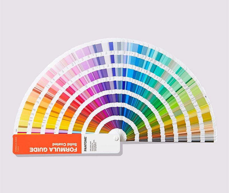
Colour Consistency & Pantone Power
When you think of iconic brands like Tiffany & Co. or Heinz, what’s the first thing that comes to mind? Probably their signature colours. If you’ve ever seen Tiffany Blue, you know the power of colour consistency. Some brands go so far as to trademark their exact Pantone shade. Tiffany & Co. owns that iconic robin’s egg blue, Heinz has nailed down the perfect ketchup red, and Cadbury purple is untouchable (except by Cadbury, obviously).
Why does this matter? Because consistency builds trust. Customers come to associate a colour with your brand, and when they see it, they instantly recognise you. Choosing a Pantone shade is like making a long-term commitment – it shows loyalty to your brand’s identity, which in turn fosters customer loyalty. After all, if you can commit to a single colour, surely your customers can commit to your product.

How BakPac Elevates Colour
At BakPac, we’re not just printing packaging – we’re making sure your colours are rich, vibrant, and exactly how you imagined them. Enter the HP Indigo 200K, this cutting-edge press is all about precision, giving you sharper, bolder, more consistent colours. Digital printing also means flexibility, fast turnaround, and the ability to tweak colours without redoing expensive printing plates. It really is a game-changer.
But colour perfection doesn’t stop at the press. We use GMG Color Management, an industry-leading system that ensures colour consistency across different materials, presses, and print runs. Different substrates absorb and reflect colour in unique ways, which can lead to variations. GMG profiles each material and brings it into the FOGRA39 colour space, standardising colour output for predictable, repeatable results. It also houses the entire Pantone colour book, allowing us to accurately convert spot colours into CMYK for precise colour matching.
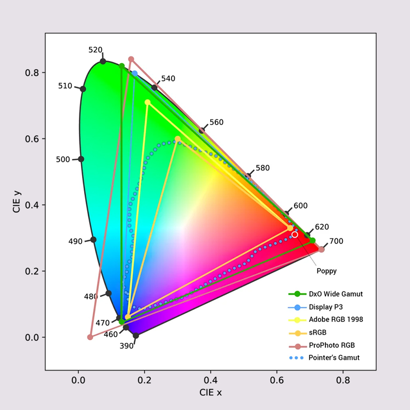
Colour Space
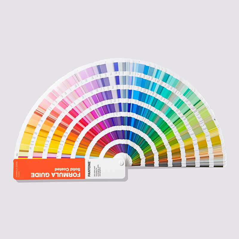
Pantone Colour Book
For brands with signature colours, we take accuracy a step further. If you have a custom brand shade, we can scan and convert it into a print-ready formula. Sometimes, standard CMYK alone can’t quite capture the vibrancy or depth of a specific colour – this is where Extended Colour Gamut (ECG) comes in. By adding Orange, Green, or Violet, we can get even closer to your exact shade, ensuring that your branding stays as consistent as possible across every print run.
We maintain a controlled print environment and utilise colour matching booths to ensure precision. For accuracy and comparison, we use light boxes to assess colours under consistent lighting conditions. Additionally, we employ X-Rite spectrophotometers to measure and match colours precisely to any given target, ensuring consistency across all materials and print runs.
We also have two high-end proofers – one dedicated to clear and silver substrates (which require white ink) and another for paper. These proofers simulate what the final printed packaging will look like, allowing us to create realistic mock-ups that can be sent to customers for approval before full production.
At the end of the day, colour management is all about control – ensuring your packaging looks exactly how you envisioned it, across every product, every batch, and every material.
And it’s not just about the ink. Our additional packaging features – matt and gloss finishes, can affect the colour as well. A deep, velvety black? A shimmering gold? A high-gloss red that looks like it’s still wet? We can make it happen. These additional features not only make your product look better – they also play a big role in how customers interact with it. After all, packaging is a multisensory experience, and the right features can turn a simple purchase into an unforgettable moment.
Conclusion
Colour is far more than just a visual element – it’s a key ingredient in creating a strong, memorable brand. At BakPac, we’re dedicated to making your packaging stand out with precise, vibrant colours that capture your brand’s essence. Ready to see your brand in full colour? Let’s make it happen.
Ready to take your packaging to the next level?
Get in touch with us to explore how our innovative features can work for you.